Yoga Branding Inspiration: Finding Colours, Style & a Brand That Feels Like You
There’s never been a more important time to build a brand that actually feels like you. I know we hear this all the time but it really is true.
The yoga world is busy. New teachers are training every day, social media is full of polished content, and AI can now generate websites, logos, captions, and colour palettes in seconds (but be aware…. there’s zero originality here). Templates are everywhere. Which means that looking “professional” isn’t really the goal any more. When Canva first burst onto the scene. it was incredible. A way that small businesses could create branding that actually looked pretty good! But now…. I’m actually seeing a swing back to more rustic content.
What people are really searching for now is connection.
Your brand is not just your colours, your fonts, or whether your Instagram grid matches. It’s the feeling people get when they land on your website. It’s the energy behind your words. It’s whether someone reads a post and thinks, “I feel safe here”, “this person understands me”, or “this is exactly what I’ve been looking for.”
The strongest yoga brands are not the most perfect. They are the most recognisable, the most human, and the most aligned.
That’s why taking the time to explore your own identity as a teacher matters so much. Before choosing colours or designing a logo, it helps to ask deeper questions about who you are, how you teach, and what experience you want people to have in your space.
Some questions to explore:
How do you want people to feel after a class with you?
What words describe your teaching style?
Are you calm and grounding, playful and uplifting, strong and empowering, soft and nurturing?
What kind of students are naturally drawn to you?
What do you value most as a teacher?
What parts of your personality do you want your brand to reflect?
If your brand was a space, what would it feel like to walk into it?
What makes your teaching experience different from someone else’s?
The answers to these questions often shape your visual branding more naturally than trends ever will. Colours, imagery, and design become much easier to choose when they’re rooted in something real.
Here are some Yoga teacher brands that I think do beautiful, cohesive branding:
Sutra by Jahnavi Claire
Sutra evokes the vibrancy, warmth, and soul of life by the banks of Ganga Maa. Inspired by the colours, textures, and energy of India, the brand invites students into a sacred journey back to themselves. We paired rich burgundy with deep orange to create a visual identity that feels grounding, expressive, and full of life, reflecting the personality of the teacher behind it.
The combination feels earthy yet bold, balancing depth and warmth with a sense of vitality and connection. It’s a reminder that yoga branding doesn’t have to be soft neutrals and muted tones to feel calming or authentic.
Yoga teachers shouldn’t be afraid of colour. Sometimes colour is exactly what helps a brand feel memorable, emotional, and alive.

Sutra hero section
Yoga with Candice
This branding has a wonderful warmth and groundedness, shaped through the combination of deep greens and rich mustard yellow tones. As a Yoga & Qi Gong teacher, Candice wanted her brand to feel restorative, calming, and connected to nature, reflecting the experience students have when they practise with her.
The earthy green palette creates a sense of exhale and steadiness, while the mustard yellow adds softness, optimism, and gentle energy without overwhelming the calm feel of the brand. Together, the colours feel nurturing, natural, and quietly confident.
The overall identity is timeless, and creates a calming atmosphere. One that feels safe, spacious, and restorative for students seeking balance in busy lives. It’s a lovely example of how colour can subtly communicate emotion and intention before someone has even read a single word.
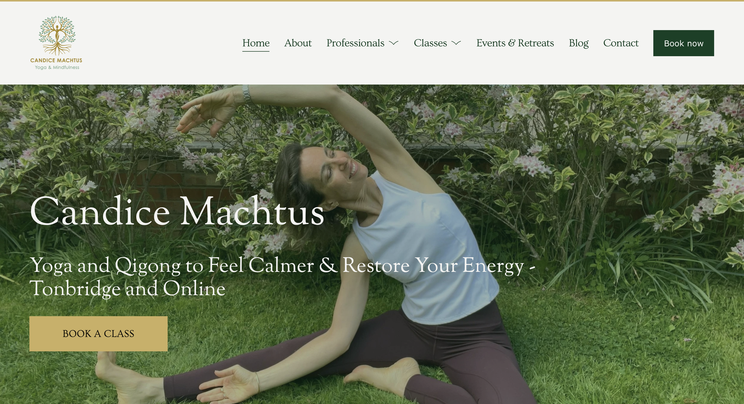
Yoga with Candice hero section
Yantra Studio
This palette is impossible to ignore in the best way. With vibrant purple, deep green, rich coral, and deep navy tones, the Yantra Studio branding feels energetic, modern, and full of personality. There are no muted sage greens here. Instead, the colours reflect the diversity and dynamism of the studio itself, from hot yoga and barre to movement, Pilates, and community events.
The bold purple brings freshness and creativity, while the coral adds warmth, confidence, and approachability. Anchoring everything is the deep navy, which gives the brand a more grounded and contemporary feel, stopping the brighter colours from becoming overwhelming.
What works so well here is the balance between playfulness and professionalism. The palette feels joyful and expressive, but still polished and intentional. It reflects a studio that isn’t afraid to stand out, take up space, and create a strong sense of identity.
This is a great reminder that yoga branding doesn’t always have to lean soft, neutral, or beige. Sometimes a bold and unapologetic palette is exactly what captures the spirit of a business and the community behind it.
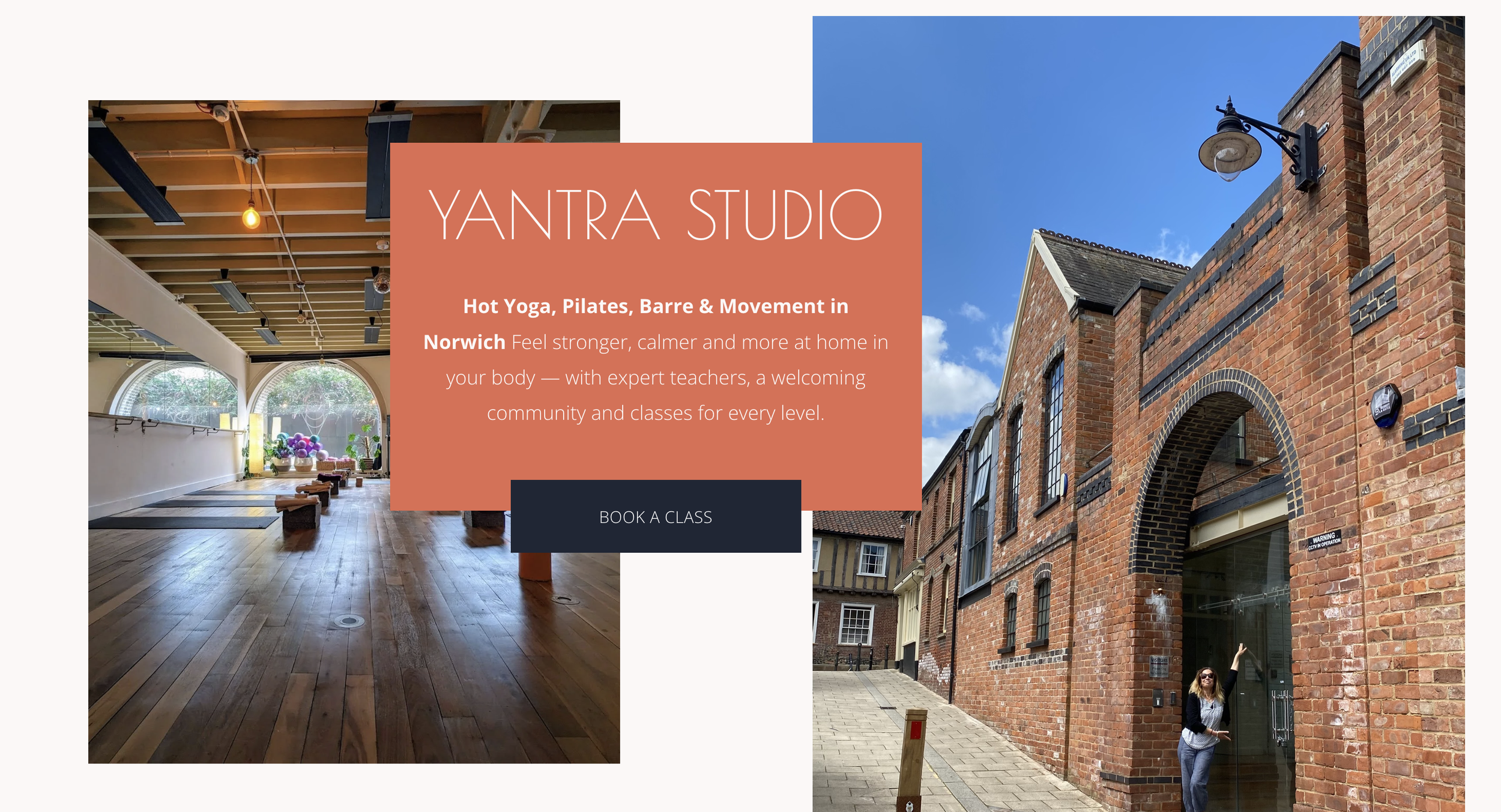
Yantra Studio hero section
Steady Light
I really enjoy the classy yet deeply warm feel of the branding for Steady Light. Created for a teacher specialising in yoga for cancer, chronic fatigue, and gentle Hatha yoga, the visual identity manages to feel calm, supportive, and professional without ever becoming clinical or cold.
The soft neutral backgrounds paired with deep teal greens and muted gold tones create a sense of steadiness and reassurance. There’s elegance in the simplicity, but also a feeling of compassion and humanity running through the entire brand.
One of the key inspirations behind the design was the Japanese art of Kintsugi, the practice of repairing broken pottery with gold, honouring the cracks rather than hiding them. The philosophy felt deeply aligned with the teacher’s work: supporting people through illness, fatigue, recovery, and life’s more difficult seasons with gentleness and care.
The subtle gold linework woven throughout the branding reflects this beautifully. It hints at healing, resilience, and the idea that we are not less valuable because we’ve struggled. In many ways, those experiences can shape us into something even more whole and meaningful.
What works especially well here is that the brand feels clean and spacious while still retaining warmth and friendliness. It proves that minimalist branding does not have to feel impersonal. Through thoughtful colour choices, soft typography, and meaningful visual storytelling, the entire experience feels welcoming, compassionate, and quietly uplifting.
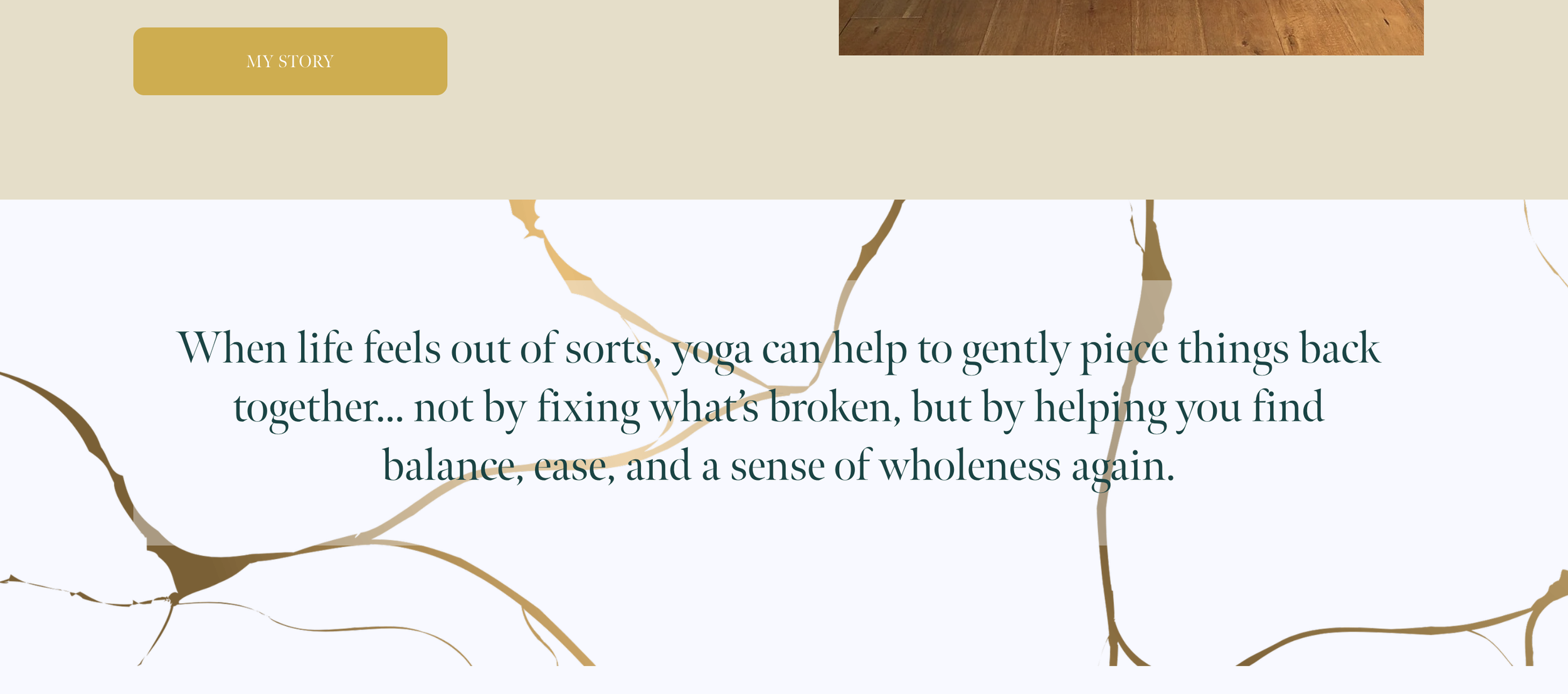
Steady Light website featuring design elements
Lemon Tree Yoga
I love the playful, welcoming personality of the Lemon Tree Yoga branding. From the soft periwinkle blues and warm buttery yellows to the rounded typography and illustrated yoga figures, the entire brand feels joyful, creative, and deeply human.
What works so beautifully here is how the branding reflects the teacher herself and the variety of experiences she offers. Alongside yoga classes and retreats, she also creates handmade wellbeing gifts and crafts, and the visual identity captures that blend of creativity, warmth, and care perfectly. It feels less like a corporate wellness brand and more like being welcomed into someone’s calming, thoughtfully curated world.
The palette is gentle but full of character. The dusky blue tones bring calmness and softness, while the pops of warm yellow add optimism, friendliness, and energy. Together, they create a brand that feels approachable and uplifting without becoming overly bright or overwhelming.
There’s also something wonderfully nostalgic and comforting about the overall design. The rounded shapes, illustrated details, and cosy imagery give it a sense of warmth and familiarity that makes you instantly feel at ease.
This is such a lovely example of how branding can feel professional while still embracing fun, creativity, and individuality. It feels authentic to the person behind the business, and that’s exactly what makes it memorable.
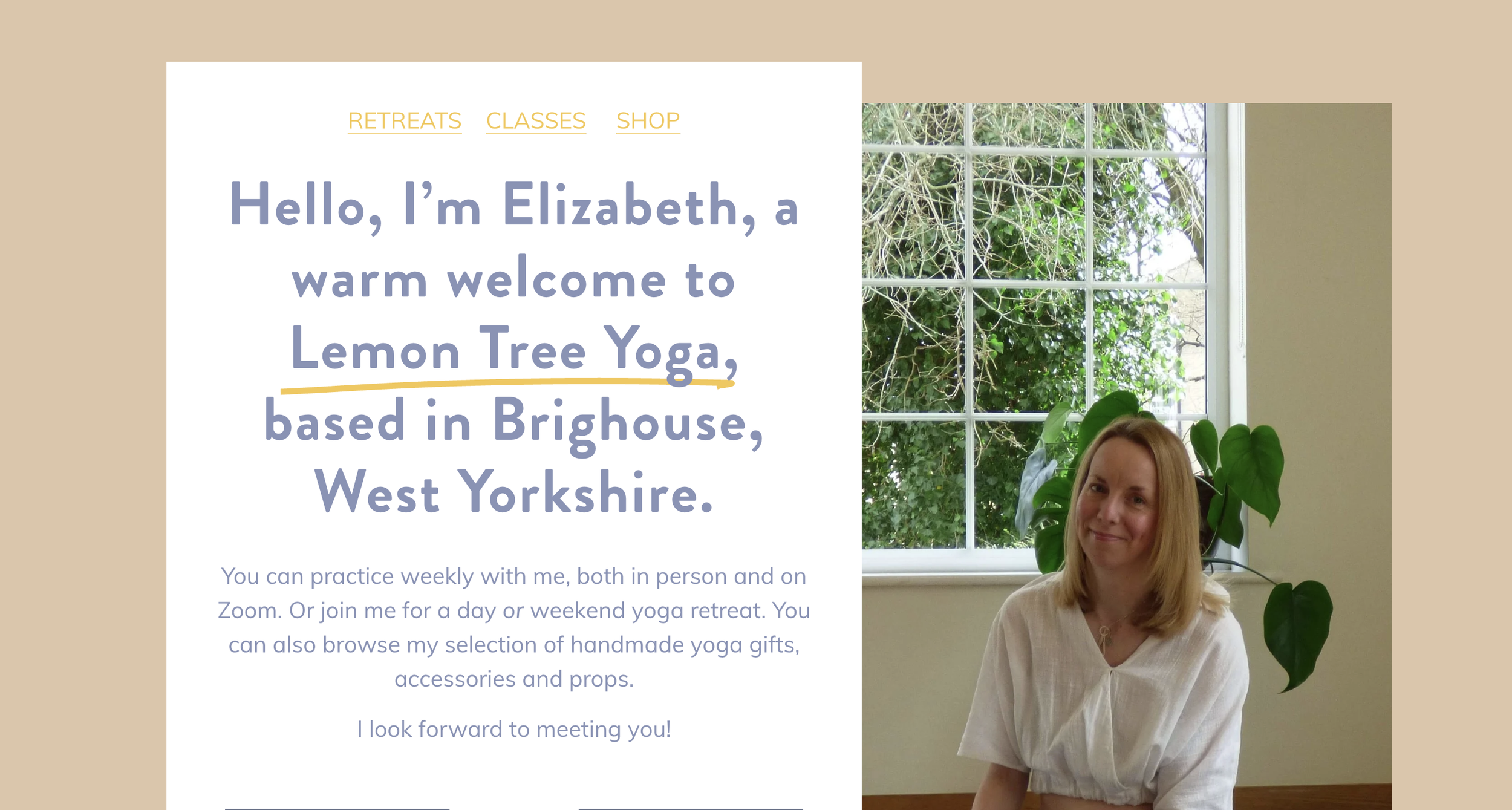
Lemon Tree Yoga hero graphic
Jasmine Yoga
Jasmine Yoga could never have been anything other than rich teals, soft sea greens, turquoise blues, and calming coastal tones. Based on the beach in Tynemouth, the branding is deeply inspired by the feeling of the sea: spacious, grounding, restorative, and like coming home.
The palette instantly evokes calmness and exhale. The soft blue-greens mirror the changing colours of the coastline and create a sense of freshness and openness, while the deeper teals add warmth, steadiness, and depth. Together, the colours create a visual identity that feels like stepping into a peaceful haven away from the noise of everyday life.
The branding was designed to reflect the experience students have when they arrive at the studio. Watching the sea from the windows (sometimes stormy, sometimes peaceful), hearing the tides, softening into stillness during restorative classes and sound baths, and feeling welcomed no matter their age, experience, or background.
What I especially love about this palette is that it feels calm without becoming bland. There’s personality and richness within the softer tones, giving the brand a sense of quiet confidence and warmth. It feels nurturing, spacious, and deeply connected to place.
This is such a good example of how branding can become an extension of environment and experience. The colours are not just aesthetically pleasing, they help communicate exactly what Jasmine Yoga offers before a student has even stepped onto the mat: a sanctuary by the sea.
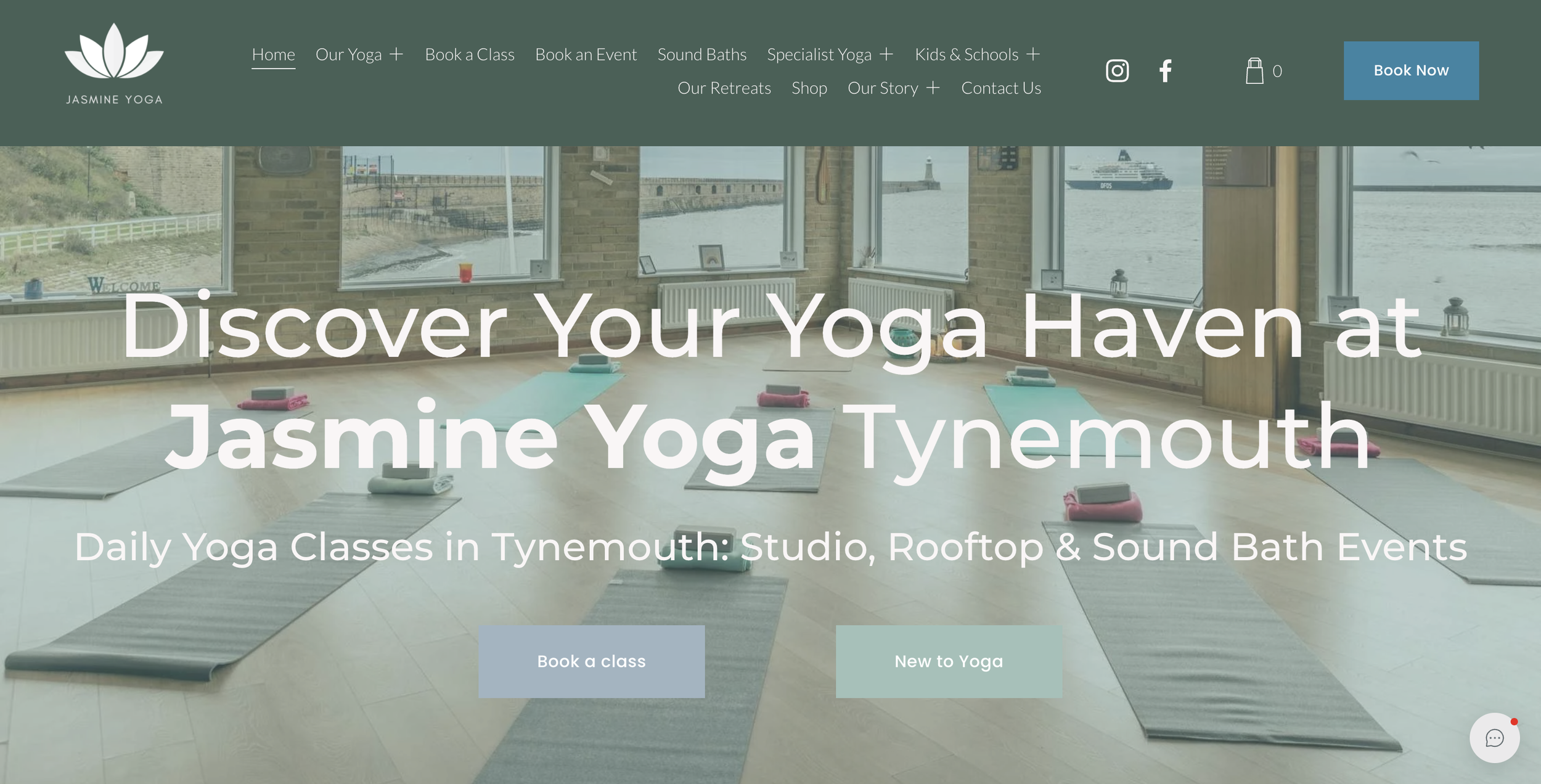
Jasmine Yoga hero section
Conclusion
Beautiful branding is not about trying to look like every other yoga teacher online.
It’s about creating a sense of recognition and trust. A feeling. A personality. A presence people remember.
In a world where AI can generate content instantly and templates can make every website look similar, your individuality becomes your biggest strength. The way you teach, the way you speak, the atmosphere you create, and the values behind your work are the things no template can replicate.
The most effective yoga brands aren’t the “perfect beige ones”. They are the ones that feel clear, consistent, and genuine.
So as you explore colour palettes, imagery, fonts, and inspiration, try not to start with what’s trendy. Start with yourself. Your story. Your students. Your energy.
Because branding is not really about creating a prettier business.
It’s about helping the right people feel at home with you.